ADT is a home security company with a simple and recognizable logo. The logo is sans serfif capital letter monogram against a blue octogon. The text is strong and the the color blue is associated with calmness and loyalty which supports the company's message and its product. The reptition of the stop sign shape logo combined the italicized tagline "ALWAYS THERE" on every step made me stop and take notice of ADT's strong presence at the Bank Atlantic Center.
Tuesday, September 22, 2009
Always There
Saturday, September 19, 2009
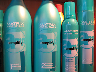
Volumizing
Sunday, September 13, 2009
Casing the Joint
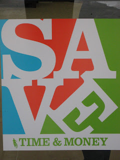
 After class last Tuesday, this poster caught my eye from across the parking lot at a shopping center. I had my camera with me so I walked right over and snapped a shot. A man came out and sternly said to me, "Is there a reason you a taking pictures of our branch?" I explained to him that it reminded me of a project we were working on in my class that day. My explanation didn't seem to matter in the least because he continued to question and reprimand me as if was prospecting the place in broad day light for my next bank heist. I honestly wasn't even certain that what seemed to me to be a vacant building was a bank until I was dismissed by the leery teller. Anyway, I got want I needed...for the time being. but just a word of advise, banks don't appreciate photography.
This composition uses white letter forms against a a three colored background, creating shapes out the negative space. I probably would have cropped it a little differently, but it did catch my eye from a distance.
Subscribe to:
Comments (Atom)
