Thursday, December 3, 2009

Art Basel '09

Here are some examples of art & typography that I saw at the preview last night of Art Basel at the Miami Beach Convention Center.

First is a logo and slogan used to encourage tourism to Basel, Switzerland.


This is the alphabet which appear backwards and glowing like neon. Each letter is fromed from a rendering of a naked human body.


Here you can catch me in "PORN" or at least my reflection snapping a shot of a metallic sculpture of serif capital letters that read as the word porn.


?


Sunday, November 22, 2009

Outdoor Signage

This lighted sign identifies the outdoor seating area at the Bank Atlantic Center in Sunrise furnished and sponsored by Carls furniture. The Carls script logo is combined with a sans serif font in all caps within in brackets not only repeat the curves of the script type but are also reminiscent of the flying saucer shaped seating and lamps outside the arena.

Monday, November 16, 2009

"Getting Better All the Time"


Part of Winn-Dixie's remodeling/rebranding initiative includes redesigns of their product packaging. I have included examples of of their new and more streamlined package designs that reflects 3 tiers of Winn Dixie brands: premium, value and "better", which would be a middle priceprice point comparable or "better" than a standard national brand. The serif typeface used in the Winn Dixie logo is more sophisticated than the bright and bold original block letters . There is a definite improvement in the "taste like butter" product name redesign that uses all lower case san serif characters. The redesigns successfully communicate a fresher, more upscale look than previous Winn Dixie brand product packaging.

Saturday, October 31, 2009

Decomposing Type

Just some examples of "found type" with a Halloween theme. This is my first attempt at carving a jack o'lantern. (better late than never)
and then, how it changed within a few days. pretty cool. or pretty ghoul-ish. and moldy.


just some found type in a little kids haunted house.
nice.


& to keep with the theme, an example of a Halloween style font.

Sunday, October 25, 2009

Time Square

There are literally shining examples of typography everywhere in the middle of Time square.

Sunday, October 18, 2009

Window Dressing

Nordstrom in Aventura Mall has a window display featuring the Burberry brand. Burberry was found in 1886 and manufactures luxury clothing and fashion accessories. The typography used on the glass is a classic serif typeface and the word "iconically" is italicized in all lowercase letters.

The iconic "Burberry classic check" is a red, black and tan tartan pattern developed in the 1920's. A far step away from its historical roots of the equestrian knight logo and checkered trenchcoat lining, the iconic brand has taken elements of the classic and given its merchandising design a modern twist.


Sunday, October 11, 2009

its raining type

Saturday, October 10, 2009

check out my mug

My coffee mug is an example of a visual image created strictly out of typographic elements. There are commercial examples of this design technique, as well many beautiful examples of fine art created with different fonts and with various levels of complexity.


Tuesday, September 22, 2009

Always There

  1. ADT is a home security company with a simple and recognizable logo. The logo is sans serfif capital letter monogram against a blue octogon. The text is strong and the the color blue is associated with calmness and loyalty which supports the company's message and its product. The reptition of the stop sign shape logo combined the italicized tagline "ALWAYS THERE" on every step made me stop and take notice of ADT's strong presence at the Bank Atlantic Center.

Saturday, September 19, 2009

Volumizing

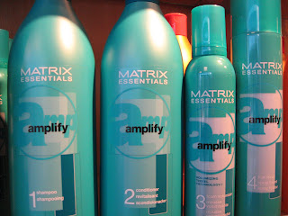
amplify-A basic sans serif font is used (looks like Arial bold) but its the size, placement, color and angle of the letters amp behind the name that really convey the message of what this product line is supposed to deliver.

Sunday, September 13, 2009

Casing the Joint

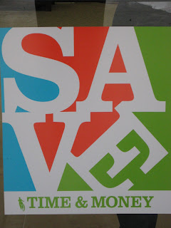
After class last Tuesday, this poster caught my eye from across the parking lot at a shopping center. I had my camera with me so I walked right over and snapped a shot. A man came out and sternly said to me, "Is there a reason you a taking pictures of our branch?" I explained to him that it reminded me of a project we were working on in my class that day. My explanation didn't seem to matter in the least because he continued to question and reprimand me as if was prospecting the place in broad day light for my next bank heist. I honestly wasn't even certain that what seemed to me to be a vacant building was a bank until I was dismissed by the leery teller. Anyway, I got want I needed...for the time being. but just a word of advise, banks don't appreciate photography.

This composition uses white letter forms against a a three colored background, creating shapes out the negative space. I probably would have cropped it a little differently, but it did catch my eye from a distance.